2.5 Example: Creating a template for “tidy” data collection
We will walk through an example of creating a template to collect data in a “tidy” format for a laboratory-based research project, based on a research project on drug efficacy in murine tuberculosis models. We will show the initial “untidy” format for data recording and show how we converted it to a “tidy” format. Finally, we will show how the data can then easily be analyzed and visualized using reproducible tools.
Objectives. After this module, the trainee will be able to:
- Understand how the principles of “tidy” data can be applied for a real, complex research project;
- List advantages of the “tidy” data format for the example project
2.5.1 Example—Data on rate of bacterial growth
The first set of data are from a study on the growth of Mycobacterium tuberculosis. The goal of this study was to compare growth yield and doubling time of Mycobacterium tuberculosis grown in rich medium under two assay conditions. One set of cultures were grown in tubes with a low culture volume relative to a large air head space to allow free oxygen exchange. A second set of cultures were grown in tubes filled to near capacity, resulting in limited air head space which has been shown elsewhere to limit oxygen availability over time. The caps on both sets of cultures were sealed to restrict air exchange during the study.
Some background information is helpful in understanding these example data, especially if you have not conducted this type of experiment. The increase in the cell size and cell mass during the development of an organism is termed growth. It is the unique characteristics of all organisms. The organism must require certain basic parameters for their energy generation and cellular biosynthesis. The growth of the organism is affected by both physical and nutritional factors. There are multiple methods by which growth can be measured, but the use of closed tissue culture tubes and a spectrophotometer to track increases in optical density (absorbance at 600 nm) over time offers several advantages: 1) it is less subject to technical error and contamination, 2) read out is fast and simple, 3) growth as measure by increased absorbance (turbidity) is directly proportional to increases in cell mass. There are four distinct phases of bacterial growth. Lag phase, log (exponential phase), stationary phase, death phase. From these data, bacterial generation times (doubling time) during the exponential growth phase can be calculated.
\[ \mbox{Doubling time} = \frac{log(2)(t_1 - t_2)}{log(OD_{t_1} - log(OD_{t_2}))} \] where \(t_1\) and \(t_2\) are two time points and \(OD_{t_1}\) and \(OD_{t_2}\) are the optical densities at the two time points (all \(log\)s are natural in this case).
An excel-based workbook (Figure 2.2) was created to allow the student performing the work to (1) calculate the amount of initial inoculum (cell culture) to add to each tube to begin the study, (2) record the raw data absorbance measurements, (3) graph the data on both a log and linear scale, and (4) calculate doubling time in two phases of growth using the equation listed above. Columns were added to allow the student to track the time (column A), the difference in time (hours) between each time point in which data were collected (column B), the date on which data were gathered (column C), and the time in hours for each data point from the start of the study for graphing purposes (column D). Absorbance data for each sampling timepoint were listed in Columns E-F (high oxygen conditions; VA001 A1, A3) or columns G-I (limited oxygen conditions; VA001 L1, L2, L3).
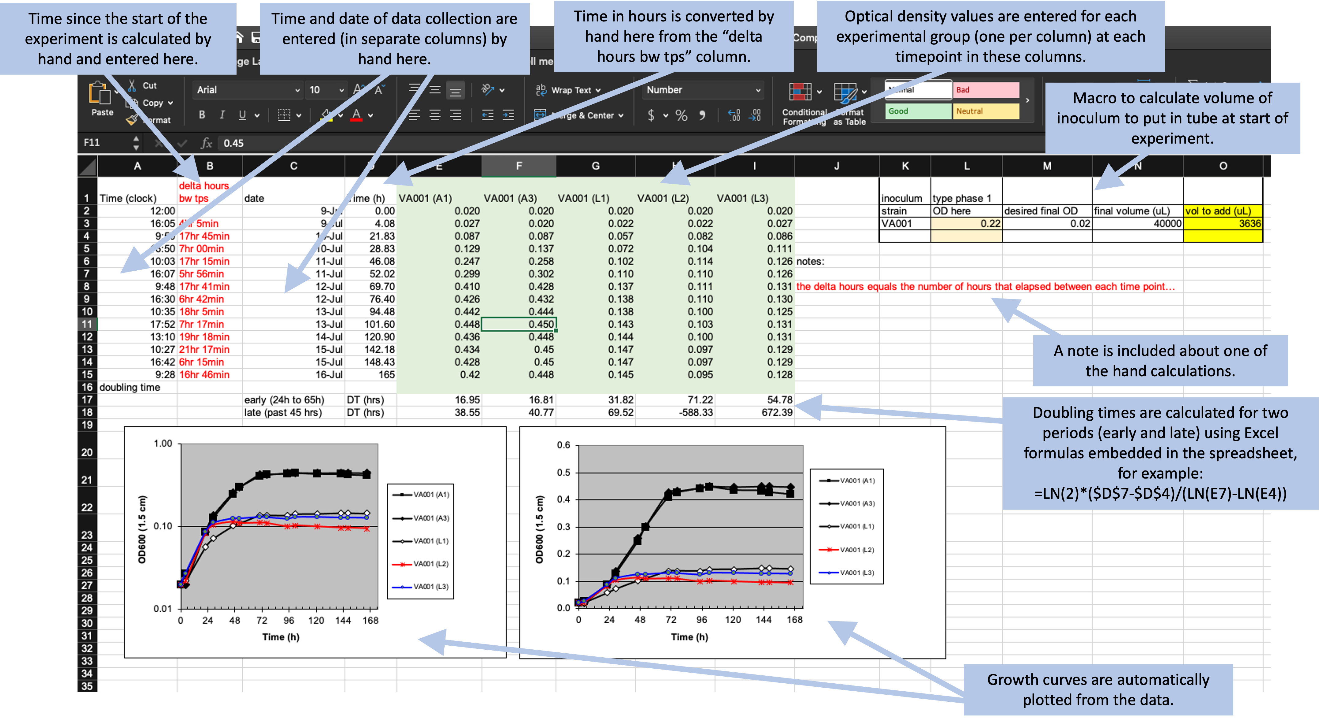
Figure 2.2: Example of an Excel spreadsheet used to record and analyze data for a laboratory experiment. Annotations highlight where data is entered by hand, where calculations are done by hand, and where embedded Excel formulas are used. The figures are created automatically using values in a specified column.
What the researchers found appealing about the format of this Excel sheet was the ease with which the student could accomplish the study goals. They also cited transparency of the raw data and ease with which additional sampling data points could be added. The data being graphed in real time and the inclusion of a simple macro to calculate doubling time, allowed the student to see tangible differences between the two assay conditions. This was also somewhat problematic as the equation to calculate doubling time was based on anchored time points built into the original spreadsheet resulting in two different results that were not properly linked to the correct data time points.
Data that are saved in a format like that shown in Figure 2.2, however, are hard to read in for a statistical program like R, Perl, or Python. In this format, the raw data (the time points each observation was collected and the optical density for the sample at that time point) form only part of the spreadsheet. The spreadsheet also includes notes, automated figures, and cells where an embedded formula runs calculations behind the scenes.
Instead of this format, we can design a simpler format to collect the data. We’ll remove all figures and calculations, and instead save those to perform in a code script. Figure 2.3 shows an example of a simpler format for collecting the same data. In this case, all the “extras” have been stripped out—this only has spaces for recording times points and the observed optical density at those time points. In later chapters, we’ll show how a code script can be used to input these data into R and then perform calculations and create figures. By separating out the steps of data recording from data analysis, you can ensure that all steps of analysis are clearly spelled out (and can be easily reproduced with other similar data) through a code script. Note that you can still collect the data in this simpler format using a spreadsheet program, if you’d like—Figure 2.3 shows the data collection set up to be recorded in a spreadsheet program, for example. Within the spreadsheet, you can choose to save the data in a plain text format (a csv [comma-separated value] file, for example).
Figure 2.3: Example of an simpler format that can be used to record and analyze data for the same laboratory experiment as the previous figure. Annotations highlight where data is entered by hand. No calculations are conducted or figures created—these are all done later, using a code script.
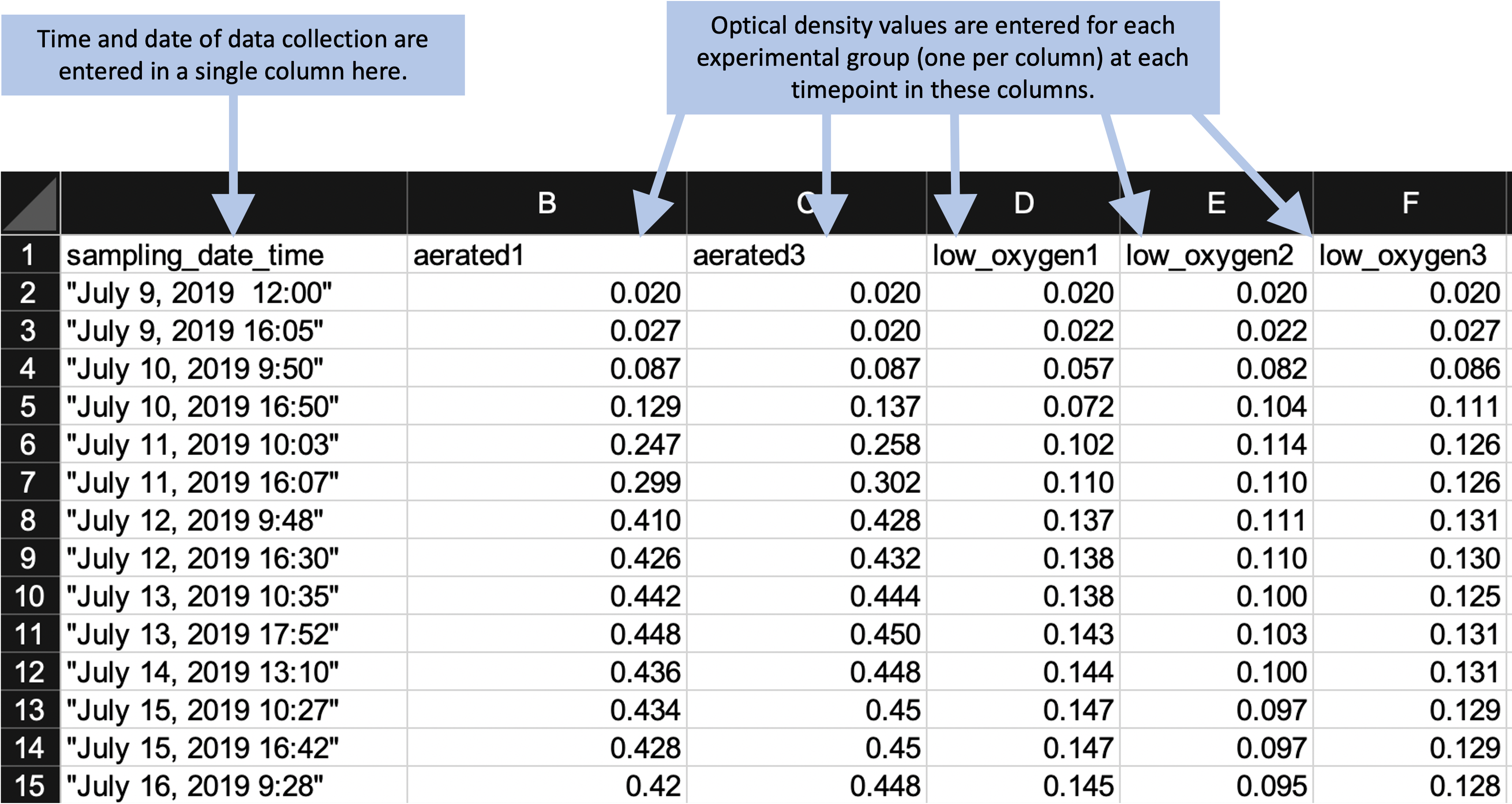
In this new data collection format, the data are not completely “tidy.” This is because there is still some information included in the column names that we might want to use for analysis and plotting—namely, the different experimental group names (e.g., “aerated1,” “low_oxygen1”). However, there is a balance in creating data collection spreadsheets. They should be in a format that is easy to read into an interactive programming environment like R, as well as in a format that will be easy to convert to a truly “tidy” format once they are read in. However, it’s okay to balance these needs with aims to make the data collection spreadsheet easy for a researcher to use.
The example shown in Figure 2.3 is designed to be easy to use when collecting data. All data points for a single collection time are grouped together on a single row. When a researchers collects data for one time point, he or she can easy confirm visually that all the experimental groups have been measured for that time point. This format still makes it easy to read the data into an interactive programming environment, however, since they are in a clear two-dimensional format, with column names in the first row and values in the remaining rows. The removal of extraneous elements—like embedded formulas, the results of hand calculations or automated calculations, and annotations through notes or colored highlighting—remove barriers when reading the data into more sophisticated software. Once the data are read into R, there can be converted into a truly tidy data format with just a few command calls.
The following code shows an example of how easy it is to read data into R in the simplified format shown in Figure 2.3. It also shows how a few lines of code can then be used to convert the data into a truly “tidy” format, and how easily sophisticated plots can then be made with the data.
library("tidyverse")
library("readxl")

# Read data into R from the simplified data collection template
growth_curve <- read_excel("data/growth_curve_data_in_excel (1)/growth curve data_GR.xls",
                           sheet = "simplified_template")

# Example of data
growth_curve
## # A tibble: 14 x 6
## sampling_date_time aerated1 aerated3 low_oxygen1 low_oxygen2 low_oxygen3
## <dttm> <dbl> <dbl> <dbl> <dbl> <dbl>
## 1 2019-07-09 12:00:00 0.02 0.02 0.02 0.02 0.02
## 2 2019-07-09 16:05:00 0.027 0.02 0.022 0.022 0.027
## 3 2019-07-10 09:50:00 0.087 0.087 0.057 0.082 0.086
## 4 2019-07-10 16:50:00 0.129 0.137 0.072 0.104 0.111
## 5 2019-07-11 10:03:00 0.247 0.258 0.102 0.114 0.126
## 6 2019-07-11 16:07:00 0.299 0.302 0.11 0.11 0.126
## 7 2019-07-12 09:48:00 0.41 0.428 0.137 0.111 0.131
## 8 2019-07-12 16:30:00 0.426 0.432 0.138 0.11 0.13
## 9 2019-07-13 10:35:00 0.442 0.444 0.138 0.1 0.125
## 10 2019-07-13 17:52:00 0.448 0.45 0.143 0.103 0.131
## 11 2019-07-14 13:10:00 0.436 0.448 0.144 0.1 0.131
## 12 2019-07-15 10:27:00 0.434 0.45 0.147 0.097 0.129
## 13 2019-07-15 16:42:00 0.428 0.45 0.147 0.097 0.129
## 14 2019-07-16 09:28:00 0.42 0.448 0.145 0.095 0.128# Convert to a fully tidy format
growth_curve <- growth_curve %>%
pivot_longer(-sampling_date_time,
names_to = "experimental_group",
values_to = "optical_density")
# How the data look after this transformation
growth_curve## # A tibble: 70 x 3
## sampling_date_time experimental_group optical_density
## <dttm> <chr> <dbl>
## 1 2019-07-09 12:00:00 aerated1 0.02
## 2 2019-07-09 12:00:00 aerated3 0.02
## 3 2019-07-09 12:00:00 low_oxygen1 0.02
## 4 2019-07-09 12:00:00 low_oxygen2 0.02
## 5 2019-07-09 12:00:00 low_oxygen3 0.02
## 6 2019-07-09 16:05:00 aerated1 0.027
## 7 2019-07-09 16:05:00 aerated3 0.02
## 8 2019-07-09 16:05:00 low_oxygen1 0.022
## 9 2019-07-09 16:05:00 low_oxygen2 0.022
## 10 2019-07-09 16:05:00 low_oxygen3 0.027
## # … with 60 more rows# Example of how easily sophisticated plots can be created with data in this format
growth_curve %>%
ggplot(aes(x = sampling_date_time, y = optical_density)) +
geom_line() +
facet_wrap(~ experimental_group)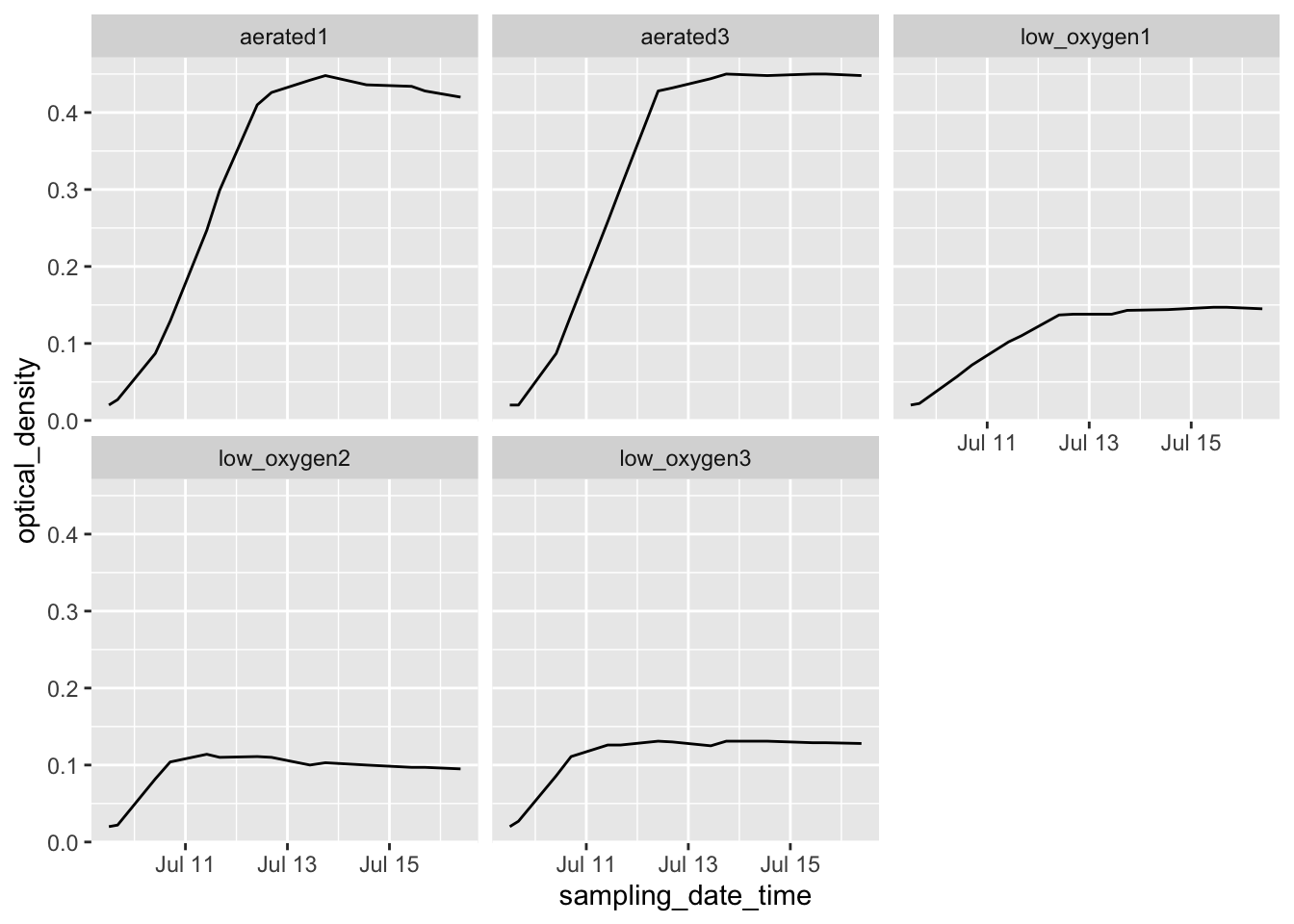 In later chapters, we’ll discuss R’s “tidyverse,” a collection of tools within R
that facilitate analyzing and visualizing data once they’ve been read into R. Here, we
only aim to give an example of how little R code is needed to create useful output from
the data, with the only requirement for gaining this power being that the data need to
be collected in a format that is “tidy” or close enough to easily read into R.
In later chapters, we’ll discuss R’s “tidyverse,” a collection of tools within R
that facilitate analyzing and visualizing data once they’ve been read into R. Here, we
only aim to give an example of how little R code is needed to create useful output from
the data, with the only requirement for gaining this power being that the data need to
be collected in a format that is “tidy” or close enough to easily read into R.
2.5.2 Example—Data on bacteria colony forming units
2.5.4 Issues with these data sets
- Issues related to using a spread sheet program
- Embedded macros
- Use of color to encode information
- Issues related to non-structured / non-two-dimensional data
- Added summary row
- Multiple tables in one sheet
- One cell value is meant to represent values for all rows below, until next non-missing row
- Issues with data being non-“tidy”
2.5.5 Final “tidy” examples
2.5.6 Options for recording tidy data
Spreadsheet program.
Spreadsheet-like interface in R.