2.1 Plot elements
ggplot2 is based on a grammar of graphics. To get the hang
of it, you’ll need to start thinking of visualizations in terms of separate elements.
This section will set up some example data and then walk through examples of some of
the elements of plots. Once you understand these, you can layer them together with
ggplot code to obtain really nice visualizations.
2.1.1 Example data
In my own research, I study the health effects of climate-related disasters, including heat waves and hurricanes. I noticed that a lot of the sessions at this conference focus on public health surveillance, so I thought it might be interesting to combine these two ideas for the example data. On September 10, 2017, Hurricane Irma hit Florida, and before it did, it triggered evacuations for much of the state. The National Highway Traffic Safety Administration (under the US Department of Transportation) tracks all the fatal motor vehicle accidents in the US through its Fatality Analysis Reporting System (FARS).5 Fatality Analysis Reporting System (FARS). A surveillance system for all fatal motor vehicle accidents in the US, maintained by the National Highway Traffic Safety Administration. For more, see the FARS website.
I downloaded and cleaned some data from this surveillance system. (In a later section, I’ll tell you more about how to do this cleaning.) I’ve created a fairly simple dataset for us to start with. For each date in the weeks around the hurricane’s landfall, it gives the total number of motor vehicle fatalities recorded in the state. The dataset also gives the week in the year for each date (the first week in January would be “1” for this measure, etc.), as well as the day of the week. Table 2.1 shows what this data looks like.
Table 2.1: Number of motor vehicle fatalities in Florida around the date of Hurricane Irma’s Florida landfall on September 10, 2017.
| Date | Week of year | Day of week | No. of motor vehicle fatalities |
|---|---|---|---|
| 2017-08-27 | 35 | Sunday | 4 |
| 2017-08-28 | 35 | Monday | 5 |
| 2017-08-29 | 35 | Tuesday | 6 |
| 2017-08-30 | 35 | Wednesday | 6 |
| 2017-08-31 | 35 | Thursday | 6 |
| 2017-09-01 | 35 | Friday | 9 |
| 2017-09-02 | 35 | Saturday | 8 |
| 2017-09-03 | 36 | Sunday | 15 |
| 2017-09-04 | 36 | Monday | 7 |
| 2017-09-05 | 36 | Tuesday | 8 |
| 2017-09-06 | 36 | Wednesday | 7 |
| 2017-09-07 | 36 | Thursday | 12 |
| 2017-09-08 | 36 | Friday | 9 |
| 2017-09-09 | 36 | Saturday | 4 |
| 2017-09-10 | 37 | Sunday | 6 |
| 2017-09-11 | 37 | Monday | 4 |
| 2017-09-12 | 37 | Tuesday | 6 |
| 2017-09-13 | 37 | Wednesday | 2 |
| 2017-09-14 | 37 | Thursday | 4 |
| 2017-09-15 | 37 | Friday | 4 |
| 2017-09-16 | 37 | Saturday | 4 |
| 2017-09-17 | 38 | Sunday | 10 |
| 2017-09-18 | 38 | Monday | 7 |
| 2017-09-19 | 38 | Tuesday | 8 |
| 2017-09-20 | 38 | Wednesday | 6 |
| 2017-09-21 | 38 | Thursday | 5 |
| 2017-09-22 | 38 | Friday | 9 |
| 2017-09-23 | 38 | Saturday | 7 |
2.1.2 Illustrating plot elements
I’ve created a simple plot of this data to use to highlight the different elements of a graph (Figure 2.1). This plot shows the number of motor vehicle fatalities in Florida per day in the weeks around Hurricane Irma, with the day of the week shown with color (since, for some health outcomes, there are patterns by the day of week).
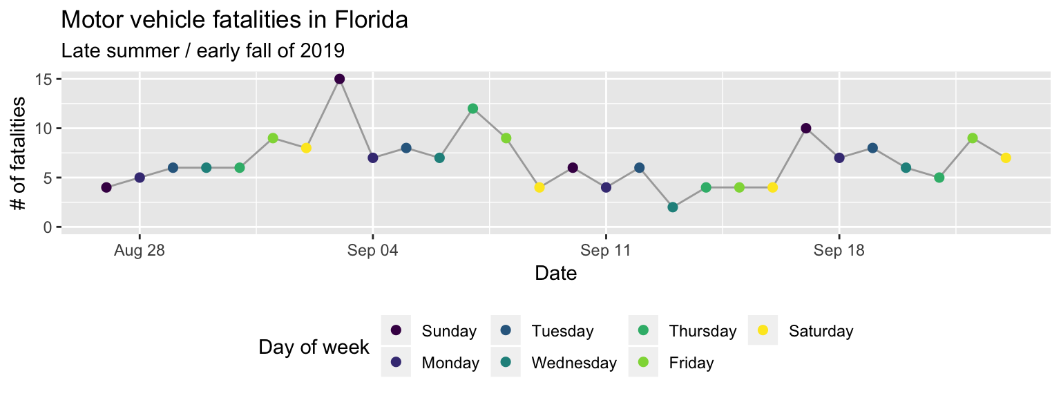
Figure 2.1: Number of motor vehicle fatalities by day in Florida in the weeks surrounding Hurricane Irma on September 10, 2019.
Let’s break this plot into some of its key elements:
- data: The data illustrated with this plot is all from the example data shown in Table 2.1.
- geoms:6 geoms. The geometric objects (e.g., points, lines, bars, columns,
polygons, rectangles, text, labels) used to display data for
ggplotplots. The geometric objects used to plot the data are (1) points (in different colors, depending on the day of week) and (2) a line (in gray). - aesthetics: For both of the geoms (points and the line), the position along the x-axis shows (is mapped to) the date given for an observation in the data. The position along the y-axis is mapped to the number of fatalities for that observation. For the points (but not the line), the color is mapped to the day of week of the observation. For the line, the color is always gray (a constant aesthetic for color), rather than color being mapped to a value in the data. Other aesthetics—like size, shape, line type and transparency—have been left at their default (constant) values.
- coordinate system: The plot uses a Cartesian coordinate system, the most common coordinate system you’ll use except when creating maps.
- scales: The plot uses a default date scale for the x-axis. For the y-axis, the scale is very similar to a default continuous scale y-axis, but has been expanded a bit to include 0. The color scaleis more customized. It uses a color scale that’s very popular right now called “viridis”, rather than the default color scale.
- labels: This plot uses the axis titles “Date” for the x-axis, “# of fatalities” for the y-axis, and “Day of week” for the color scale. In a minute, when you start working with the example data, you’ll see that these are changed from the corresponding column names in the data, to make the plot easier to understand. In addition, the plot has both a title (“Motor vehicle fatalities in Florida”) and a subtitle (“Late summer / early fall of 2019”).
- theme:7 theme. A collection of specifications for the background elements
of the plot, including the plot background, grid lines, legend position, text size and
font, margins, and axis ticks.
This plot uses the default
theme_graytheme, with a gray background to the main plot area, white gridlines, a Sans Serif font family, and a base font size of 11. The one customization is that the legend (which here provides the key for how color maps to day of the week) is shown on the bottom of the plot rather than to the right of the plot. - faceting: This plot does not take advantage of faceting. Instead, the data is plotted on a single background. The next example will show an example of faceting based on a characteristic of the data.
To help the meaning of these elements sink in, Figure 2.2 shows a second example plot, with the elements again explained below the plot.
Figure 2.2: Number of motor vehicle fatalities in Florida by day of the week and week for the weeks surrounding Hurricane Irma’s landfall.
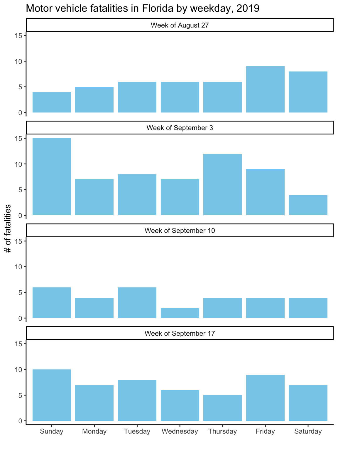
Here’s the breakdown of plot elements for this plot:
- data: The data illustrated with this plot is the same as for Figure 2.2, the example data shown in Table 2.1.
- geoms: The geometric objects used to plot the data are columns.
- aesthetics: For the column geoms, the x-axis position is mapped to the day of the week and the y-axis position is mapped to the number of fatalities. The color is mapped to a constant aesthetic, sky blue.
- coordinate system: The plot uses a Cartesian coordinate system.
- scales: The plot uses a default discrete scale for the x-axis and the default continuous scale for the y-axis.
- labels: This plot uses the axis titles “Date” for the x-axis, “# of fatalities” for the y-axis, and “Day of week” for the color scale. In a minute, when you start working with the example data, you’ll see that these are changed from the corresponding column names in the data, to make the plot easier to understand. In addition, the plot has both a title (“Motor vehicle fatalities in Florida”) and a subtitle (“Late summer / early fall of 2019”).
- theme: This plot uses the
theme_classictheme, with a white background to the main plot area, no gridlines, a Sans Serif font family, and axis lines only on the left and bottom sides of the plot area. - faceting: This plot facets by week. This variable was obtained from the “week” column in the dataset, although some changes were made to have better labeling of the facets (e.g., “Week of August 27” rather than “35”).