Chapter 3 Time series / case-crossover studies
We’ll start by exploring common characteristics in time series data for environmental epidemiology. In the first half of the class, we’re focusing on a very specific type of study—one that leverages large-scale vital statistics data, collected at a regular time scale (e.g., daily), combined with large-scale measurements of a climate-related exposure, with the goal of estimating the typical relationship between the level of the exposure and risk of a health outcome. For example, we may have daily measurements of particulate matter pollution for a city, measured daily at a set of Environmental Protection Agency (EPA) monitors. We want to investigate how risk of cardiovascular mortality changes in the city from day to day in association with these pollution levels. If we have daily counts of the number of cardiovascular deaths in the city, we can create a statistical model that fits the exposure-response association between particulate matter concentration and daily risk of cardiovascular mortality. These statistical models—and the type of data used to fit them—will be the focus of the first part of this course.
3.1 Readings
The required readings for this chapter are:
Bhaskaran et al. (2013) Provides an overview of time series regression in environmental epidemiology.
Vicedo-Cabrera, Sera, and Gasparrini (2019) Provides a tutorial of all the steps for a projecting of health impacts of temperature extremes under climate change. One of the steps is to fit the exposure-response association using present-day data (the section on “Estimation of Exposure-Response Associations” in the paper). In this chapter, we will go into details on that step, and that section of the paper is the only required reading for this chapter. Later in the class, we’ll look at other steps covered in this paper. Supplemental material for this paper is available to download by going to https://journals.lww.com/epidem/fulltext/2019/05000/hands_on_tutorial_on_a_modeling_framework_for.3.aspx and scrolling down to the bottom to find the Supplemental Material. You will need the data in this supplement for the exercises for class.
The following are supplemental readings (i.e., not required, but may be of interest) associated with the material in this chapter:
- B. Armstrong et al. (2012) Commentary that provides context on how epidemiological research on temperature and health can help inform climate change policy.
- Dominici and Peng (2008c) Overview of study designs for studying climate-related exposures (air pollution in this case) and human health. Chapter in a book that is available online through the CSU library.
- B. Armstrong (2006) Covers similar material as Bhaskaran et al. (2013), but with more focus on the statistical modeling framework
- Gasparrini and Armstrong (2010) Describes some of the advances made to time series study designs and statistical analysis, specifically in the context of temperature
- Basu, Dominici, and Samet (2005) Compares time series and case-crossover study designs in the context of exploring temperature and health. Includes a nice illustration of different referent periods, including time-stratified.
- B. G. Armstrong, Gasparrini, and Tobias (2014) This paper describes different data structures for case-crossover data, as well as how conditional Poisson regression can be used in some cases to fit a statistical model to these data. Supplemental material for this paper is available at https://bmcmedresmethodol.biomedcentral.com/articles/10.1186/1471-2288-14-122#Sec13.
- Imai et al. (2015) Typically, the time series study design covered in this chapter is used to study non-communicable health outcomes. This paper discusses opportunities and limitations in applying a similar framework for infectious disease.
- Dominici and Peng (2008b) Heavier on statistics. Describes some of the statistical challenges of working with time series data for air pollution epidemiology. Chapter in a book that is available online through the CSU library.
- Lu and Zeger (2007) Heavier on statistics. This paper shows how, under conditions often common for environmental epidemiology studies, case-crossover and time series methods are equivalent.
- Gasparrini (2014) Heavier on statistics. This provides the statistical framework for the distributed lag model for environmental epidemiology time series studies.
- Dunn and Smyth (2018) Introduction to statistical models, moving into regression models and generalized linear models. Chapter in a book that is available online through the CSU library.
- James et al. (2013) General overview of linear regression, with an R coding “lab” at the end to provide coding examples. Covers model fit, continuous, binary, and categorical covariates, and interaction terms. Chapter in a book that is available online through the CSU library.
3.2 Time series and case-crossover study designs
In the first half of this course, we’ll take a deep look at how researchers can study how environmental exposures and health risk are linked using time series studies. Let’s start by exploring the study design for this type of study, as well as a closely linked study design, that of case-crossover studies.
It’s important to clarify the vocabulary we’re using here. We’ll use the terms time series study and case-crossover study to refer specifically to a type of study common for studying air pollution and other climate-related exposures. However, both terms have broader definitions, particularly in fields outside environmental epidemiology. For example, a time series study more generally refers to a study where data is available for the same unit (e.g., a city) for multiple time points, typically at regularly-spaced times (e.g., daily). A variety of statistical methods have been developed to apply to gain insight from this type of data, some of which are currently rarely used in the specific fields of air pollution and climate epidemiology that we’ll explore here. For example, there are methods to address autocorrelation over time in measurements—that is, that measurements taken at closer time points are likely somewhat correlated—that we won’t cover here and that you won’t see applied often in environmental epidemiology studies, but that might be the focus of a “Time Series” course in a statistics or economics department.
In air pollution and climate epidemiology, time series studies typically begin with study data collected for an aggregated area (e.g., city, county, ZIP code) and with a daily resolution. These data are usually secondary data, originally collected by the government or other organizations through vital statistics or other medical records (for the health data) and networks of monitors for the exposure data. In the next section of this chapter, we’ll explore common characteristics of these data. These data are used in a time series study to investigate how changes in the daily level of the exposure is associated with risk of a health outcome, focusing on the short-term period. For example, a study might investigate how risk of respiratory hospitalization in a city changes in relationship with the concentration of particulate matter during the week or two following exposure. The study period for these studies is often very long (often a decade or longer), and while single-community time series studies can be conducted, many time series studies for environmental epidemiology now include a large set of communities of national or international scope.
The study design essentially compares a community with itself at different time points—asking if health risk tends to be higher on days when exposure is higher. By comparing the community to itself, the design removes many challenges that would come up when comparing one community to another (e.g., is respiratory hospitalization risk higher in city A than city B because particulate matter concentrations are typically higher in city A?). Communities differ in demographics and other factors that influence health risk, and it can be hard to properly control for these when exploring the role of environmental exposures. By comparison, demographics tend to change slowly over time (at least, compared to a daily scale) within a community.
One limitation, however, is that the study design is often best-suited to study acute effects, but more limited in studying chronic health effects. This is tied to the design and traditional ways of statistically modeling the resulting data. Since a community is compared with itself, the design removes challenges in comparing across communities, but it introduces new ones in comparing across time. Both environmental exposures and rates of health outcomes can have strong patterns over time, both across the year (e.g., mortality rates tend to follow a strong seasonal pattern, with higher rates in winter) and across longer periods (e.g., over the decade or longer of a study period). These patterns must be addressed through the statistical model fit to the time series data, and they make it hard to disentangle chronic effects of the exposure from unrelated temporal patterns in the exposure and outcome, and so most time series studies will focus on the short-term (or acute) association between exposure and outcome, typically looking at a period of at most about a month following exposure.
The term case-crossover study is a bit more specific than time series study, although there has been a strong movement in environmental epidemiology towards applying a specific version of the design, and so in this field the term often now implies this more specific version of the design. Broadly, a case-crossover study is one in which the conditions at the time of a health outcome are compared to conditions at other times that should otherwise (i.e., outside of the exposure of interest) be comparable. A case-crossover study could, for example, investigate the association between weather and car accidents by taking a set of car accidents and investigating how weather during the car accident compared to weather in the same location the week before.
One choice in a case-crossover study design is how to select the control time periods. Early studies tended to use a simple method for this—for example, taking the day before, or a day the week before, or some similar period somewhat close to the day of the outcome. As researchers applied the study design to large sets of data (e.g., all deaths in a community over multiple years), they noticed that some choices could create bias in estimates. As a result, most environmental epidemiology case-crossover studies now use a time-stratified approach to selecting control days. This selects a set of control days that typically include days both before and after the day of the health outcome, and are a defined set of days within a “stratum” that should be comparable in terms of temporal trends. For daily-resolved data, this stratum typically will include all the days within a month, year, and day of week. For example, one stratum of comparable days might be all the Mondays in January of 2010. These stratums are created throughout the study period, and then days are only compared to other days within their stratum (although, fortunately, there are ways you can apply a single statistical model to fit all the data for this approach rather than having to fit code stratum-by-stratum over many years).
When this is applied to data at an aggregated level (e.g., city, county, or ZIP code), it is in spirit very similar to a time series study design, in that you are comparing a community to itself at different time points. The main difference is that a time series study uses statistical modeling to control from potential confounding from temporal patterns, while a case-crossover study of this type instead controls for this potential confounding by only comparing days that should be “comparable” in terms of temporal trends, for example, comparing a day only to other days in the same month, year, and day of week. You will often hear that case-crossover studies therefore address potential confounding for temporal patterns “by design” rather than “statistically” (as in time series studies). However, in practice (and as we’ll explore in this class), in environmental epidemiology, case-crossover studies often are applied to aggregated community-level data, rather than individual-level data, with exposure assumed to be the same for everyone in the community on a given day. Under these assumptions, time series and case-crossover studies have been determined to be essentially equivalent (and, in fact, can use the same study data), only with slightly different terms used to control for temporal patterns in the statistical model fit to the data. Several interesting papers have been written to explore differences and similarities in these two study designs as applied in environmental epidemiology (Basu, Dominici, and Samet 2005; B. G. Armstrong, Gasparrini, and Tobias 2014; Lu and Zeger 2007).
These types of study designs in practice use similar datasets. In earlier presentations of the case-crossover design, these data would be set up a bit differently for statistical modeling. More recent work, however, has clarified how they can be modeled similarly to when using a time series study design, allowing the data to be set up in a similar way (B. G. Armstrong, Gasparrini, and Tobias 2014).
Several excellent commentaries or reviews are available that provide more details on these two study designs and how they have been used specifically investigate the relationship between climate-related exposures and health (Bhaskaran et al. 2013; B. Armstrong 2006; Gasparrini and Armstrong 2010). Further, these designs are just two tools in a wider collection of study designs that can be used to explore the health effects of climate-related exposures. Dominici and Peng (2008c) provides a nice overview of this broader set of designs.
3.3 Time series data
Let’s explore the type of dataset that can be used for these
time series–style studies in environmental epidemiology. In the examples
in this chapter, we’ll be using data that comes as part of the Supplemental
Material in one of this chapter’s required readings, (Vicedo-Cabrera, Sera, and Gasparrini 2019).
You can access this article at: https://journals.lww.com/epidem/fulltext/2019/05000/hands_on_tutorial_on_a_modeling_framework_for.3.aspx
Follow the link for the supplement for this article and then look for the
file “lndn_obs.csv”. This is the file we’ll use as the example data in this
chapter.
These data are saved in a csv format (that is, a plain text file, with commas
used as the delimiter), and so they can be read into R using the read_csv
function from the readr package (part of the tidyverse). For example, you can
use the following code to read in these data, assuming you have saved them in a
“data” subdirectory of your current working directory:
library(tidyverse) # Loads all the tidyverse packages, including readr
obs <- read_csv("data/lndn_obs.csv")
obs
## # A tibble: 8,279 × 14
## date year month day doy dow all all_0_64 all_65_74 all_75_84
## <date> <dbl> <dbl> <dbl> <dbl> <chr> <dbl> <dbl> <dbl> <dbl>
## 1 1990-01-01 1990 1 1 1 Mon 220 38 38 82
## 2 1990-01-02 1990 1 2 2 Tue 257 50 67 87
## 3 1990-01-03 1990 1 3 3 Wed 245 39 59 86
## 4 1990-01-04 1990 1 4 4 Thu 226 41 45 77
## 5 1990-01-05 1990 1 5 5 Fri 236 45 54 85
## 6 1990-01-06 1990 1 6 6 Sat 235 48 48 84
## 7 1990-01-07 1990 1 7 7 Sun 231 38 49 96
## 8 1990-01-08 1990 1 8 8 Mon 235 46 57 76
## 9 1990-01-09 1990 1 9 9 Tue 250 48 54 96
## 10 1990-01-10 1990 1 10 10 Wed 214 44 46 62
## # ℹ 8,269 more rows
## # ℹ 4 more variables: all_85plus <dbl>, tmean <dbl>, tmin <dbl>, tmax <dbl>This example dataset shows many characteristics that are common for datasets for time series studies in environmental epidemiology. Time series data are essentially a sequence of data points repeatedly taken over a certain time interval (e.g., day, week, month etc). General characteristics of time series data for environmental epidemiology studies are:
- Observations are given at an aggregated level. For example, instead of
individual observations for each person in London, the
obsdata give counts of deaths throughout London. The level of aggregation is often determined by geopolitical boundaries, for example, counties or ZIP codes in the US. - Observations are given at regularly spaced time steps over a period. In the
obsdataset, the time interval is day. Typically, values will be provided continuously over that time period, with observations for each time interval. Occasionally, however, the time series data may only be available for particular seasons (e.g., only warm season dates for an ozone study), or there may be some missing data on either the exposure or health outcome over the course of the study period. - Observations are available at the same time step (e.g., daily) for (1) the health outcome, (2) the environmental
exposure of interest, and (3) potential time-varying confounders. In the
obsdataset, the health outcome is mortality (from all causes; sometimes, the health outcome will focus on a specific cause of mortality or other health outcomes such as hospitalizations or emergency room visits). Counts are given for everyone in the city for each day (allcolumn), as well as for specific age categories (all_0_64for all deaths among those up to 64 years old, and so on). The exposure of interest in theobsdataset is temperature, and three metrics of this are included (tmean,tmin, andtmax). Day of the week is one time-varying factor that could be a confounder, or at least help explain variation in the outcome (mortality). This is included through thedowvariable in theobsdata. Sometimes, you will also see a marker for holidays included as a potential time-varying confounder, or other exposure variables (temperature is a potential confounder, for example, when investigating the relationship between air pollution and mortality risk). - Multiple metrics of an exposure and / or multiple health outcome counts
may be included for each time step. In the
obsexample, three metrics of temperature are included (minimum daily temperature, maximum daily temperature, and mean daily temperature). Several counts of mortality are included, providing information for specific age categories in the population. The different metrics of exposure will typically be fit in separate models, either as a sensitivity analysis or to explore how exposure measurement affects epidemiological results. If different health outcome counts are available, these can be modeled in separate statistical models to determine an exposure-response function for each outcome.
3.4 Exploratory data analysis
When working with time series data, it is helpful to start with some exploratory data analysis. This type of time series data will often be secondary data—it is data that was previously collected, as you are re-using it. Exploratory data analysis is particularly important with secondary data like this. For primary data that you collected yourself, following protocols that you designed yourself, you will often be very familiar with the structure of the data and any quirks in it by the time you are ready to fit a statistical model. With secondary data, however, you will typically start with much less familiarity about the data, how it was collected, and any potential issues with it, like missing data and outliers.
Exploratory data analysis can help you become familiar with your data. You can use
summaries and plots to explore the parameters of the data, and also to identify
trends and patterns that may be useful in designing an appropriate statistical
model. For example, you can explore how values of the health outcome are distributed,
which can help you determine what type of regression model would be appropriate, and
to see if there are potential confounders that have regular relationships with
both the health outcome and the exposure of interest. You can see how many
observations have missing data for the outcome, the exposure, or confounders of
interest, and you can see if there are any measurements that look unusual.
This can help in identifying quirks in how the data were recorded—for example,
in some cases ground-based weather monitors use -99 or -999 to represent missing
values, definitely something you want to catch and clean-up in your data
(replacing with R’s NA for missing values) before fitting a statistical model!
The following applied exercise will take you through some of the
questions you might want to answer through this type of exploratory analysis.
In
general, the tidyverse suite of R packages has loads of tools for exploring and
visualizing data in R.
The lubridate package from the tidyverse, for example, is an excellent tool for working with date-time data
in R, and time series data will typically have at least one column with the
timestamp of the observation (e.g., the date for daily data).
You may find it worthwhile to explore this package some more. There is a helpful
chapter in Wickham and Grolemund (2016), https://r4ds.had.co.nz/dates-and-times.html, as well
as a cheatsheet at
https://evoldyn.gitlab.io/evomics-2018/ref-sheets/R_lubridate.pdf. For
visualizations, if you are still learning techniques in R, two books
you may find useful are
Healy (2018) (available online at https://socviz.co/) and Chang (2018)
(available online at http://www.cookbook-r.com/Graphs/).
Applied: Exploring time series data
Read the example time series data into R and explore it to answer the following questions:
- What is the study period for the example
obsdataset? (i.e., what dates / years are covered by the time series data?) - Are there any missing dates (i.e., dates with nothing recorded) within this time period? Are there any recorded dates where health outcome measurements are missing? Any where exposure measurements are missing?
- Are there seasonal trends in the exposure? In the outcome?
- Are there long-term trends in the exposure? In the outcome?
- Is the outcome associated with day of week? Is the exposure associated with day of week?
Based on your exploratory analysis in this section, talk about the potential for confounding when these data are analyzed to estimate the association between daily temperature and city-wide mortality. Is confounding by seasonal trends a concern? How about confounding by long-term trends in exposure and mortality? How about confounding by day of week?
Applied exercise: Example code
- What is the study period for the example
obsdataset? (i.e., what dates / years are covered by the time series data?)
In the obs dataset, the date of each observation is included in a column called
date. The data type of this column is “Date”—you can check this by using
the class function from base R:
## [1] "Date"Since this column has a “Date” data type, you can run some mathematical function
calls on it. For example, you can use the min function from base R to get the
earliest date in the dataset and the max function to get the latest.
## [1] "1990-01-01"## [1] "2012-08-31"You can also run the range function to get both the earliest and latest dates
with a single call:
## [1] "1990-01-01" "2012-08-31"This provides the range of the study period for these data. One interesting point is that it’s not a round set of years—instead, the data ends during the summer of the last study year. This doesn’t present a big problem, but is certainly something to keep in mind if you’re trying to calculate yearly averages of any values for the dataset. If you’re getting the average of something that varies by season (e.g., temperature), it could be slightly weighted by the months that are included versus excluded in the partial final year of the dataset. Similarly, if you group by year and then count totals by year, the number will be smaller for the last year, since only part of the year’s included. For example, if you wanted to count the total deaths in each year of the study period, it will look like they go down a lot the last year, when really it’s only because only about half of the last year is included in the study period:
obs %>%
  group_by(year) %>%
  summarize(deaths_in_year = sum(all)) %>%
  ggplot(aes(x = year, y = deaths_in_year)) +
  geom_line() +
geom_point() 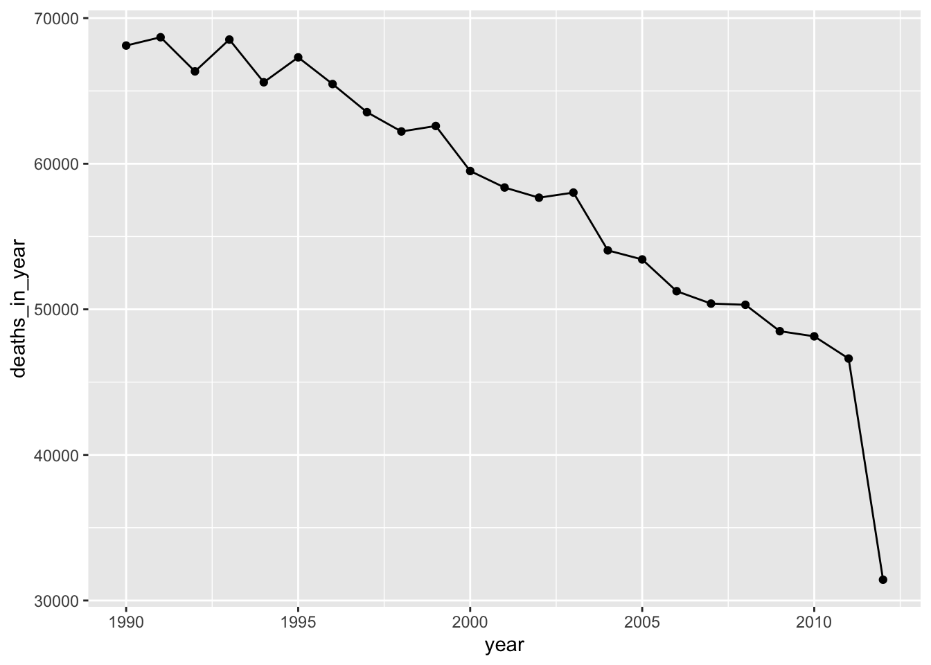
- Are there any missing dates within this time period? Are there any recorded dates where health outcome measurements are missing? Any where exposure measurements are missing?
There are a few things you should check to answer this question. First
(and easiest), you can check to see if there are any NA values within
any of the observations in the dataset. This helps answer the second and third
parts of the question. The summary function will provide
a summary of the values in each column of the dataset, including the count
of missing values (NAs) if there are any:
##       date                 year          month             day
##  Min.   :1990-01-01   Min.   :1990   Min.   : 1.000   Min.   : 1.00
##  1st Qu.:1995-09-01   1st Qu.:1995   1st Qu.: 3.000   1st Qu.: 8.00
##  Median :2001-05-02   Median :2001   Median : 6.000   Median :16.00
##  Mean   :2001-05-02   Mean   :2001   Mean   : 6.464   Mean   :15.73
##  3rd Qu.:2006-12-31   3rd Qu.:2006   3rd Qu.: 9.000   3rd Qu.:23.00
##  Max.   :2012-08-31   Max.   :2012   Max.   :12.000   Max.   :31.00
##       doy            dow                 all           all_0_64
##  Min.   :  1.0   Length:8279        Min.   : 81.0   Min.   : 9.0
##  1st Qu.: 90.5   Class :character   1st Qu.:138.0   1st Qu.:27.0
##  Median :180.0   Mode  :character   Median :157.0   Median :32.0
##  Mean   :181.3                      Mean   :160.2   Mean   :32.4
##  3rd Qu.:272.0                      3rd Qu.:178.0   3rd Qu.:37.0
##  Max.   :366.0                      Max.   :363.0   Max.   :64.0
##    all_65_74       all_75_84        all_85plus         tmean
##  Min.   : 6.00   Min.   : 17.00   Min.   : 17.00   Min.   :-5.503
##  1st Qu.:23.00   1st Qu.: 41.00   1st Qu.: 39.00   1st Qu.: 7.470
##  Median :29.00   Median : 49.00   Median : 45.00   Median :11.465
##  Mean   :30.45   Mean   : 50.65   Mean   : 46.68   Mean   :11.614
##  3rd Qu.:37.00   3rd Qu.: 58.00   3rd Qu.: 53.00   3rd Qu.:15.931
##  Max.   :70.00   Max.   :138.00   Max.   :128.00   Max.   :29.143
##       tmin             tmax
##  Min.   :-8.940   Min.   :-3.785
##  1st Qu.: 3.674   1st Qu.:10.300
##  Median : 7.638   Median :14.782
##  Mean   : 7.468   Mean   :15.058
##  3rd Qu.:11.438   3rd Qu.:19.830
##  Max.   :20.438   Max.   :37.087
Based on this analysis, all observations are complete for all dates included
in the dataset. There are no listings for NAs for any of the columns, and
this indicates no missing values in the dates for which there’s a row in the data.
However, this does not guarantee that every date between the start date and
end date of the study period are included in the recorded data. Sometimes,
some dates might not get recorded at all in the dataset, and the summary
function won’t help you determine when this is the case. One common example in
environmental epidemiology is with ozone pollution data. These are sometimes
only measured in the warm season, and so may be shared in a dataset with all
dates outside of the warm season excluded.
There are a few alternative explorations you can do to check this. Perhaps the easiest is to check the number of days between the start and end date of the study period, and then see if the number of observations in the dataset is the same:
# Calculate number of days in study period
obs %>%            # Using piping (%>%) throughout to keep code clear
  pull(date) %>%   # Extract the `date` column as a vector
  range() %>%      # Take the range of dates (earliest and latest)
  diff()           # Calculate time difference from start to finish of study
## Time difference of 8278 days## [1] 8279This indicates that there is an observation for every date over the study period, since the number of observations should be one more than the time difference. In the next question, we’ll be plotting observations by time, and typically this will also help you see if there are large chunks of missing dates in the data.
- Are there seasonal trends in the exposure? In the outcome?
You can use a simple plot to visualize patterns over time in both the exposure
and the outcome. For example, the following code plots a dot for each daily
temperature observation over the study period. The points are set to a smaller
size (size = 0.5) and plotted with some transparency (alpha = 0.5) since
there are so many observations.
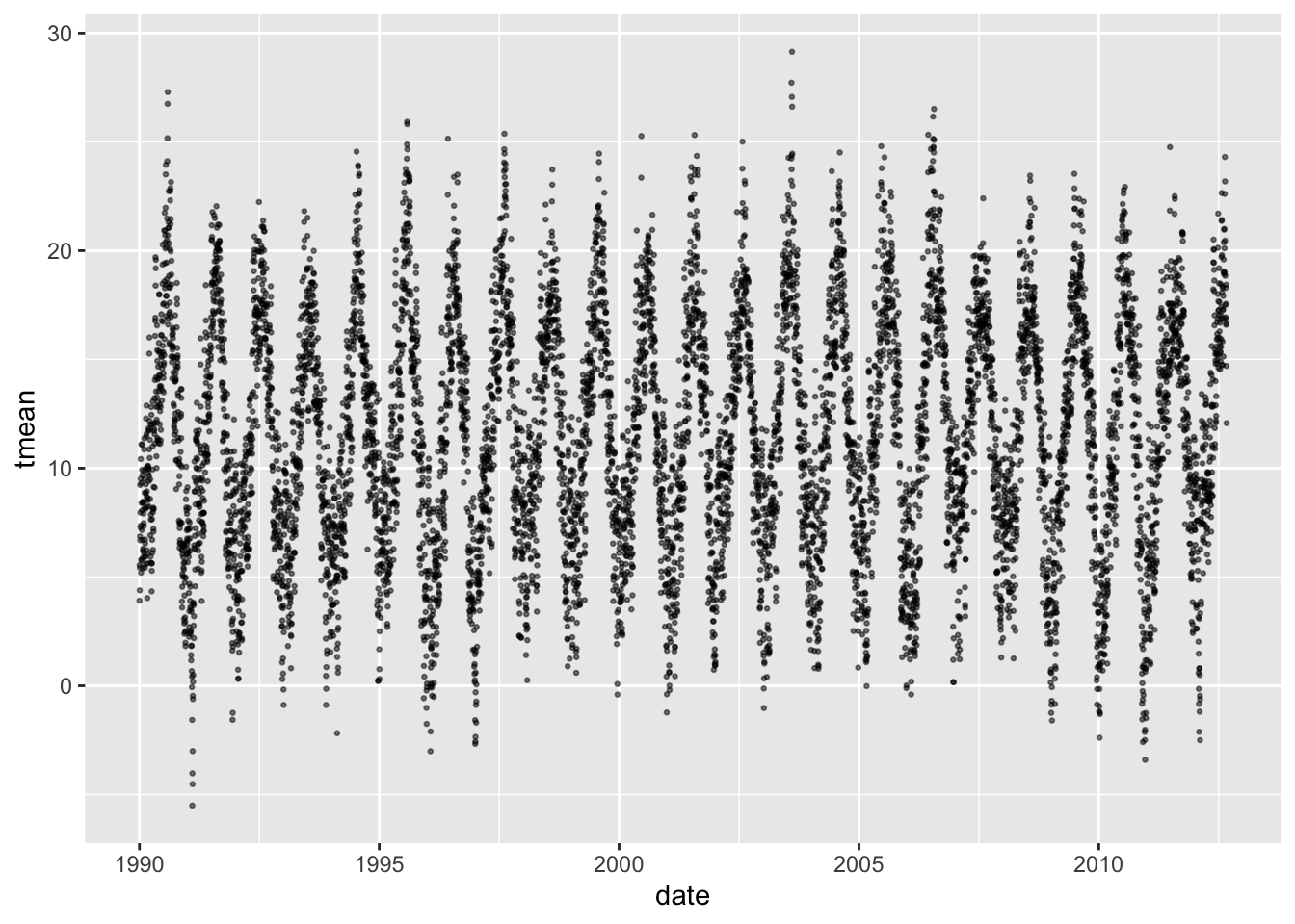
There is (unsurprisingly) clear evidence here of a strong seasonal trend in mean temperature, with values typically lowest in the winter and highest in the summer.
You can plot the outcome variable in the same way:
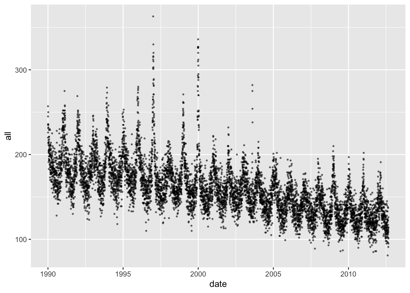
Again, there are seasonal trends, although in this case they are inversed. Mortality tends to be highest in the winter and lowest in the summer. Further, the seasonal pattern is not equally strong in all years—some years it has a much higher winter peak, probably in conjunction with severe influenza seasons.
Another way to look for seasonal trends is with a heatmap-style visualization, with day of year along the x-axis and year along the y-axis. This allows you to see patterns that repeat around the same time of the year each year (and also unusual deviations from normal seasonal patterns).
For example, here’s a plot showing temperature in each year, where the
observations are aligned on the x-axis by time in year. We’re using the doy—which stands for “day of year” (i.e., Jan 1 = 1; Jan 2 = 2; … Dec 31 = 365 as long
as it’s not a leap year) as the measure of time in the year. We’ve reversed
the y-axis so that the earliest years in the study period start at the top
of the visual, then later study years come later—this is a personal style,
and it would be no problem to leave the y-axis as-is. We’ve used the
viridis color scale for the fill, since that has a number of features
that make it preferable to the default R color scale, including that it
is perceptible for most types of color blindness and be printed out in grayscale
and still be correctly interpreted.
library(viridis)
ggplot(obs, aes(x = doy, y = year, fill = tmean)) +
  geom_tile() +
  scale_y_reverse() +
  scale_fill_viridis()
From this visualization, you can see that temperatures tend to be higher in the summer months and lower in the winter months. “Spells” of extreme heat or cold are visible—where extreme temperatures tend to persist over a period, rather than randomly fluctuating within a season. You can also see unusual events, like the extreme heat wave in the summer of 2003, indicated with the brightest yellow in the plot.
We created the same style of plot for the health outcome. In this case, we focused on mortality among the oldest age group, as temperature sensitivity tends to increase with age, so this might be where the strongest patterns are evident.
ggplot(obs, aes(x = doy, y = year, fill = all_85plus)) +
  geom_tile() +
  scale_y_reverse() +
  scale_fill_viridis()
For mortality, there tends to be an increase in the winter compared to the summer. Some winters have stretches with particularly high mortality—these are likely a result of seasons with strong influenza outbreaks. You can also see on this plot the impact of the 2003 heat wave on mortality among this oldest age group—an unusual spot of light green in the summer.
- Are there long-term trends in the exposure? In the outcome?
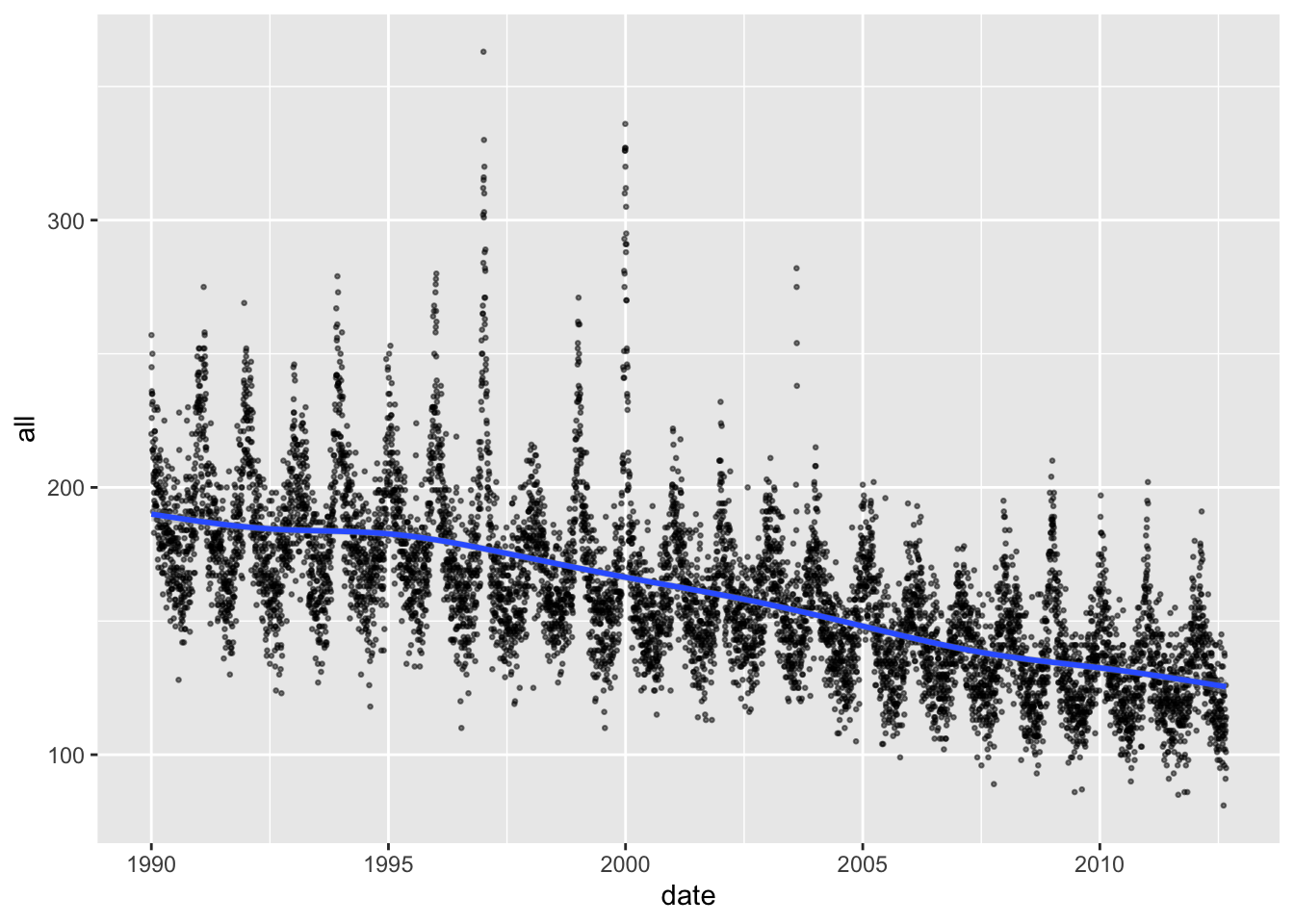
Some of the plots we created in the last section help in exploring this question. For example, the following plot shows a clear pattern of decreasing daily mortality counts, on average, over the course of the study period:

It can be helpful to add a smooth line to help detect these longer-term
patterns, which you can do with geom_smooth:
You could also take the median mortality count across each year in the study period, although you should take out any years without a full year’s worth of data before you do this, since there are seasonal trends in the outcome:
obs %>%
  group_by(year) %>%
  filter(year != 2012) %>% # Take out the last year
  summarize(median_mort = median(all)) %>%
  ggplot(aes(x = year, y = median_mort)) +
  geom_line()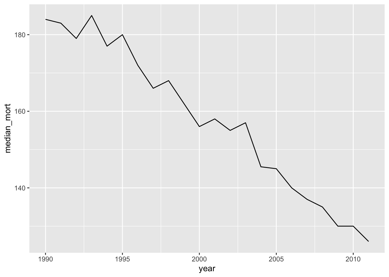
Again, we see a clear pattern of decreasing mortality rates in this city over time. This means we need to think carefully about long-term time patterns as a potential confounder. It will be particularly important to think about this if the exposure also has a strong pattern over time. For example, air pollution regulations have meant that, in many cities, there may be long-term decreases in pollution concentrations over a study period.
- Is the outcome associated with day of week? Is the exposure associated with day of week?
The data already has day of week as a column in the data (dow). However,
this is in a character data type, so it doesn’t have the order of weekdays
encoded (e.g., Monday comes before Tuesday). This makes it hard to look for
patterns related to things like weekend / weekday.
## [1] "character"We could convert this to a factor and encode the weekday order when we do
it, but it’s even easier to just recreate the column from the date column.
We used the wday function from the lubridate package to do this—it extracts
weekday as a factor, with the order of weekdays encoded (using a special
“ordered” factor type):
## [1] "ordered" "factor"## [1] "Sun" "Mon" "Tue" "Wed" "Thu" "Fri" "Sat"We looked at the mean, median, and 25th and 75th quantiles of the mortality counts by day of week:
obs %>%
  group_by(dow) %>%
  summarize(mean(all),
            median(all),
            quantile(all, 0.25),
            quantile(all, 0.75))
## # A tibble: 7 × 5
## dow `mean(all)` `median(all)` `quantile(all, 0.25)` `quantile(all, 0.75)`
## <ord> <dbl> <dbl> <dbl> <dbl>
## 1 Sun 156. 154 136 173
## 2 Mon 161. 159 138 179
## 3 Tue 161. 158 139 179
## 4 Wed 160. 157 138. 179
## 5 Thu 161. 158 139 179
## 6 Fri 162. 159 141 179
## 7 Sat 159. 156 137 178Mortality tends to be a bit higher on weekdays than weekends, but it’s not a dramatic difference.
We did the same check for temperature:
obs %>%
  group_by(dow) %>%
  summarize(mean(tmean),
            median(tmean),
            quantile(tmean, 0.25),
            quantile(tmean, 0.75))
## # A tibble: 7 × 5
## dow `mean(tmean)` `median(tmean)` `quantile(tmean, 0.25)`
## <ord> <dbl> <dbl> <dbl>
## 1 Sun 11.6 11.3 7.48
## 2 Mon 11.6 11.4 7.33
## 3 Tue 11.5 11.4 7.48
## 4 Wed 11.7 11.7 7.64
## 5 Thu 11.6 11.5 7.57
## 6 Fri 11.6 11.6 7.41
## 7 Sat 11.6 11.5 7.53
## # ℹ 1 more variable: `quantile(tmean, 0.75)` <dbl>In this case, there does not seem to be much of a pattern by weekday.
You can also visualize the association using boxplots:

You can also try violin plots—these show the full distribution better than boxplots, which only show quantiles.
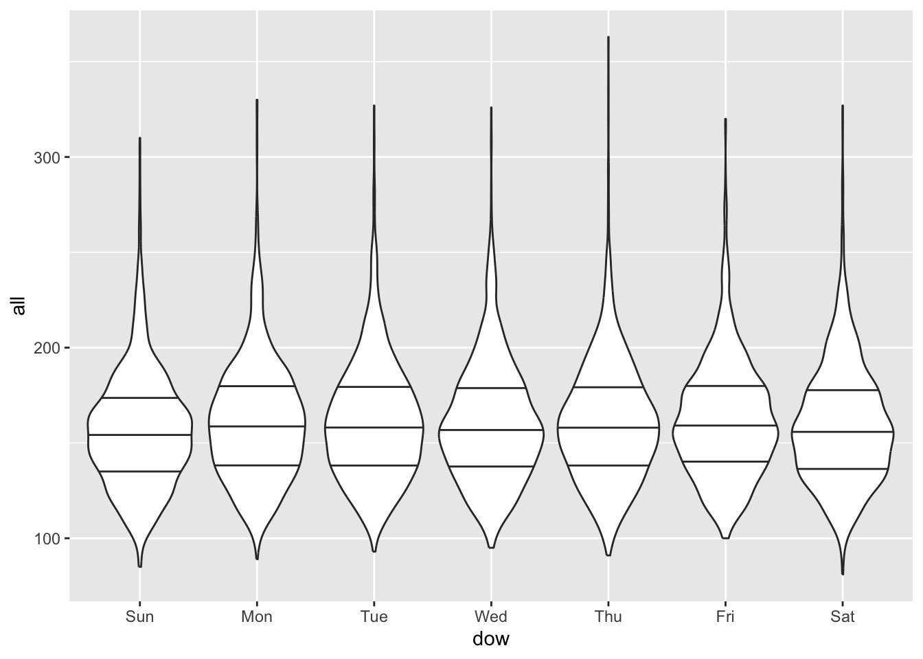
All these reinforce that there are some small differences in weekend versus weekday patterns for mortality. There isn’t much pattern by weekday with temperature, so in this case weekday is unlikely to be a confounder (the same is not true with air pollution, which often varies based on commuting patterns and so can have stronger weekend/weekday differences). However, since it does help some in explaining variation in the health outcome, it might be worth including in our models anyway, to help reduce random noise.
Exploratory data analysis is an excellent tool for exploring your data before you begin fitting a statistical model, and you should get in the habit of using it regularly in your research. Dominici and Peng (2008a) provides another walk-through of exploring this type of data, including some more advanced tools for exploring autocorrelation and time patterns.
3.5 Statistical modeling for a time series study
Now that we’ve explored the data typical of a time series study in climate epidemiology, we’ll look at how we can fit a statistical model to those data to gain insight into the relationship between the exposure and acute health effects. Very broadly, we’ll be using a statistical model to answer the question: How does the relative risk of a health outcome change as the level of the exposure changes, after controlling for potential confounders?
In the rest of this chapter and the next chapter, we’ll move step-by-step to build up to the statistical models that are now typically used in these studies. Along the way, we’ll discuss key components and choices in this modeling process. The statistical modeling is based heavily on regression modeling, and specifically generalized linear regression. To help you get the most of this section, you may find it helpful to review regression modeling and generalized linear models. Some resources for that include Dunn and Smyth (2018) and James et al. (2013) .
One of the readings for this week, Vicedo-Cabrera, Sera, and Gasparrini (2019), includes a section on fitting exposure-response functions to describe the association between daily mean temperature and mortality risk. This article includes example code in its supplemental material, with code for fitting the model to these time series data in the file named “01EstimationERassociation.r”. Please download that file and take a look at the code.
The model in the code may at first seem complex, but it is made up of a number of fairly straightforward pieces (although some may initially seem complex):
- The model framework is a generalized linear model (GLM)
- This GLM is fit assuming an error distribution and a link function appropriate for count data
- The GLM is fit assuming an error distribution that is also appropriate for data that may be overdispersed
- The model includes control for day of the week by including a categorical variable
- The model includes control for long-term and seasonal trends by including a spline (in this case, a natural cubic spline) for the day in the study
- The model fits a flexible, non-linear association between temperature and mortality risk, also using a spline
- The model fits a flexible non-linear association between temperature on a series of preceeding days and current day and mortality risk on the current day using a distributed lag approach
- The model jointly describes both of the two previous non-linear associations by fitting these two elements through one construct in the GLM, a cross-basis term
In this section and the next chapter, we will work through the elements, building up the code to get to the full model that is fit in Vicedo-Cabrera, Sera, and Gasparrini (2019).
Fitting a GLM to time series data
The generalized linear model (GLM) framework unites a number of types of
regression models you may have previously worked with. One basic regression
model that can be fit within this framework is a linear regression model.
However, the framework also allows you to also fit, among others, logistic
regression models (useful when the outcome variable can only take one of two
values, e.g., success / failure or alive / dead) and Poisson regression models
(useful when the outcome variable is a count or rate). This generalized
framework brings some unity to these different types of regression models. From
a practical standpoint, it has allowed software developers to easily provide a
common interface to fit these types of models. In R, the common function call to
fit GLMs is glm.
Within the GLM framework, the elements that separate different regression models include the link function and the error distribution. The error distribution encodes the assumption you are enforcing about how the errors after fitting the model are distributed. If the outcome data are normally distributed (a.k.a., follow a Gaussian distribution), after accounting for variance explained in the outcome by any of the model covariates, then a linear regression model may be appropriate. For count data—like numbers of deaths a day—this is unlikely, unless the average daily mortality count is very high (count data tend to come closer to a normal distribution the further their average gets from 0). For binary data—like whether each person in a study population died on a given day or not—normally distributed errors are also unlikely. Instead, in these two cases, it is typically more appropriate to fit GLMs with Poisson and binomial “families”, respectively, where the family designation includes an appropriate specification for the variance when fitting the model based on these outcome types.
The other element that distinguishes different types of regression within the GLM framework is the link function. The link function applies a transformation on the combination of independent variables in the regression equation when fitting the model. With normally distributed data, an identity link is often appropriate—with this link, the combination of independent variables remain unchanged (i.e., keep their initial “identity”). With count data, a log link is often more appropriate, while with binomial data, a logit link is often used.
Finally, data will often not perfectly adhere to assumptions. For example, the Poisson family of GLMs assumes that variance follows a Poisson distribution (The probability mass function for Poisson distribution \(X \sim {\sf Poisson}(\mu)\) is denoted by \(f(k;\mu)=Pr[X=k]= \displaystyle \frac{\mu^{k}e^{-\mu}}{k!}\), where \(k\) is the number of occurences, and \(\mu\) is equal to the expected number of cases). With this distribution, the variance is equal to the mean (\(\mu=E(X)=Var(X)\)). With real-life data, this assumption is often not valid, and in many cases the variance in real life count data is larger than the mean. This can be accounted for when fitting a GLM by setting an error distribution that does not require the variance to equal the mean—instead, both a mean value and something like a variance are estimated from the data, assuming an overdispersion parameter \(\phi\) so that \(Var(X)=\phi E(X)\). In environmental epidemiology, time series are often fit to allow for this overdispersion. This is because if the data are overdispersed but the model does not account for this, the standard errors on the estimates of the model parameters may be artificially small. If the data are not overdispersed (\(\phi=1\)), the model will identify this when being fit to the data, so it is typically better to prefer to allow for overdispersion in the model (if the size of the data were small, you may want to be parsimonious and avoid unneeded complexity in the model, but this is typically not the case with time series data).
In the next section, you will work through the steps of developing a GLM to fit
the example dataset obs. For now, you will only fit a linear association
between mean daily temperature and mortality risk, eventually including control
for day of week. In later work, especially the next chapter, we will build up
other components of the model, including control for the potential confounders
of long-term and seasonal patterns, as well as advancing the model to fit
non-linear associations, distributed by time, through splines, a distributed lag
approach, and a cross-basis term.
Applied: Fitting a GLM to time series data
In R, the function call used to fit GLMs is glm. Most of you have likely
covered GLMs, and ideally this function call, in previous courses. If you are
unfamiliar with its basic use, you will want to refresh yourself on this
topic—you can use some of the resources noted earlier in this section and in
the chapter’s “Supplemental Readings” to do so.
- Fit a GLM to estimate the association between mean daily temperature (as the
independent variable) and daily mortality count (as the dependent variable),
first fitting a linear regression. (Since the mortality data are counts, we will
want to shift to a different type of regression within the GLM framework, but
this step allows you to develop a simple
glmcall, and to remember where to include the data and the independent and dependent variables within this function call.) - Change your function call to fit a regression model in the Poisson family.
- Change your function call to allow for overdispersion in the outcome data (daily mortality count). How does the estimated coefficient for temperature change between the model fit for #2 and this model? Check both the central estimate and its estimated standard error.
- Change your function call to include control for day of week.
Applied exercise: Example code
- Fit a GLM to estimate the association between mean daily temperature (as the independent variable) and daily mortality count (as the dependent variable), first fitting a linear regression.
This is the model you are fitting:
\(Y_{t}=\beta_{0}+\beta_{1}X1_{t}+\epsilon\)
where \(Y_{t}\) is the mortality count on day \(t\), \(X1_{t}\) is the mean temperature for day \(t\) and \(\epsilon\) is the error term. Since this is a linear model we are assuming a Gaussian error distribution \(\epsilon \sim {\sf N}(0, \sigma^{2})\), where \(\sigma^{2}\) is the variance not explained by the covariates (here just temperature).
To do this, you will use the glm call. If you would like to save model fit
results to use later, you assign the output a name as an R object
(mod_linear_reg in the example code). If your study data are in a dataframe,
you can specify these data in the glm call with the data parameter.
Once you do this, you can use column names directly in the model formula.
In the model formula, the dependent variable is specified first (all, the
column for daily mortality counts for all ages, in this example), followed
by a tilde (~), followed by all independent variables (only tmean in this
example). If multiple independent variables are included, they are joined using
+. We’ll see an example when we start adding control for confounders later.
Once you have fit a model and assigned it to an R object, you can explore it
and use resulting values. First, the print method for a regression model
gives some summary information. This method is automatically called if you
enter the model object’s name at the console:
##
## Call:  glm(formula = all ~ tmean, data = obs)
##
## Coefficients:
## (Intercept)        tmean
##     187.647       -2.366
##
## Degrees of Freedom: 8278 Total (i.e. Null);  8277 Residual
## Null Deviance:       8161000
## Residual Deviance: 6766000   AIC: 79020
More information is printed if you run the summary method on the model
object:
##
## Call:
## glm(formula = all ~ tmean, data = obs)
##
## Coefficients:
##              Estimate Std. Error t value Pr(>|t|)
## (Intercept) 187.64658    0.73557  255.10   <2e-16 ***
## tmean        -2.36555    0.05726  -41.31   <2e-16 ***
## ---
## Signif. codes:  0 '***' 0.001 '**' 0.01 '*' 0.05 '.' 0.1 ' ' 1
##
## (Dispersion parameter for gaussian family taken to be 817.4629)
##
##     Null deviance: 8161196  on 8278  degrees of freedom
## Residual deviance: 6766140  on 8277  degrees of freedom
## AIC: 79019
##
## Number of Fisher Scoring iterations: 2
Make sure you are familiar with the information provided from the model object, as well as how to interpret values like the coefficient estimates and their standard errors and p-values. These basic elements should have been covered in previous coursework (even if a different programming language was used to fit the model), and so we will not be covering them in great depth here, but instead focusing on some of the more advanced elements of how regression models are commonly fit to data from time series and case-crossover study designs in environmental epidemiology. For a refresher on the basics of fitting statistical models in R, you may want to check out Chapters 22 through 24 of Wickham and Grolemund (2016), a book that is available online, as well as Dunn and Smyth (2018) and James et al. (2013) .
Finally, there are some newer tools for extracting information from model fit
objects. The broom package extracts different elements from these objects
and returns them in a “tidy” data format, which makes it much easier to use
the output further in analysis with functions from the “tidyverse” suite of
R packages. These tools are very popular and powerful, and so the broom tools
can be very useful in working with output from regression modeling in R.
The broom package includes three main functions for extracting data from
regression model objects. First, the glance function returns overall data
about the model fit, including the AIC and BIC:
## # A tibble: 1 × 8
##   null.deviance df.null  logLik    AIC    BIC deviance df.residual  nobs
##           <dbl>   <int>   <dbl>  <dbl>  <dbl>    <dbl>       <int> <int>
## 1      8161196.    8278 -39507. 79019. 79041. 6766140.        8277  8279
The tidy function returns data at the level of the model coefficients,
including the estimate for each model parameter, its standard error, test
statistic, and p-value.
## # A tibble: 2 × 5
##   term        estimate std.error statistic p.value
##   <chr>          <dbl>     <dbl>     <dbl>   <dbl>
## 1 (Intercept)   188.      0.736      255.        0
## 2 tmean          -2.37    0.0573     -41.3       0
Finally, the augment function returns data at the level of the original
observations, including the fitted value for each observation, the residual
between the fitted and true value, and some measures of influence on the model
fit.
## # A tibble: 8,279 × 8
##      all tmean .fitted .resid     .hat .sigma  .cooksd .std.resid
##    <dbl> <dbl>   <dbl>  <dbl>    <dbl>  <dbl>    <dbl>      <dbl>
##  1   220  3.91    178.   41.6 0.000359   28.6 0.000380       1.46
##  2   257  5.55    175.   82.5 0.000268   28.6 0.00112        2.89
##  3   245  4.39    177.   67.7 0.000330   28.6 0.000928       2.37
##  4   226  5.43    175.   51.2 0.000274   28.6 0.000440       1.79
##  5   236  6.87    171.   64.6 0.000211   28.6 0.000539       2.26
##  6   235  9.23    166.   69.2 0.000144   28.6 0.000420       2.42
##  7   231  6.69    172.   59.2 0.000218   28.6 0.000467       2.07
##  8   235  7.96    169.   66.2 0.000174   28.6 0.000467       2.31
##  9   250  7.27    170.   79.5 0.000197   28.6 0.000761       2.78
## 10   214  9.51    165.   48.9 0.000139   28.6 0.000202       1.71
## # ℹ 8,269 more rows
One way you can use augment is to graph the fitted values for each observation
after fitting the model:
mod_linear_reg %>%
  augment() %>%
  ggplot(aes(x = tmean)) +
  geom_point(aes(y = all), alpha = 0.4, size = 0.5) +
  geom_line(aes(y = .fitted), color = "red") +
  labs(x = "Mean daily temperature", y = "Expected mortality count")
For more on the broom package, including some excellent examples of how it
can be used to streamline complex regression analyses, see Robinson (2014).
There is also a nice example of how it can be used in one of the chapters of
Wickham and Grolemund (2016), available online at https://r4ds.had.co.nz/many-models.html.
- Change your function call to fit a regression model in the Poisson family.
A linear regression is often not appropriate when fitting a model where the outcome variable provides counts, as with the example data, since such data often don’t follow a normal distribution. A Poisson regression is typically preferred.
For a count distribution were \(Y \sim {\sf Poisson(\mu)}\) we typically fit a model such as
\(g(Y)=\beta_{0}+\beta_{1}X1\), where \(g()\) represents the link function, in this case a log function so that \(log(Y)=\beta_{0}+\beta_{1}X1\). We can also express this as \(Y=exp(\beta_{0}+\beta_{1}X1)\).
In the glm call, you can specify this with the family
parameter, for which “poisson” is one choice.
One thing to keep in mind with this change is that the model now uses a
non-identity link between the combination of independent variable(s) and the
dependent variable. You will need to keep this in mind when you interpret
the estimates of the regression coefficients. While the coefficient estimate
for tmean from the linear regression could be interpreted as the expected
increase in mortality counts for a one-unit (i.e., one degree Celsius) increase
in temperature, now the estimated coefficient should be interpreted as the
expected increase in the natural log-transform of mortality count for a one-unit
increase in temperature.
##
## Call:
## glm(formula = all ~ tmean, family = "poisson", data = obs)
##
## Coefficients:
##               Estimate Std. Error z value Pr(>|z|)
## (Intercept)  5.2445409  0.0019704 2661.67   <2e-16 ***
## tmean       -0.0147728  0.0001583  -93.29   <2e-16 ***
## ---
## Signif. codes:  0 '***' 0.001 '**' 0.01 '*' 0.05 '.' 0.1 ' ' 1
##
## (Dispersion parameter for poisson family taken to be 1)
##
##     Null deviance: 49297  on 8278  degrees of freedom
## Residual deviance: 40587  on 8277  degrees of freedom
## AIC: 97690
##
## Number of Fisher Scoring iterations: 4
You can see this even more clearly if you take a look at the association between temperature for each observation and the expected mortality count fit by the model. First, if you look at the fitted values without transforming, they will still be in a state where mortality count is log-transformed. You can see by looking at the range of the y-scale that these values are for the log of expected mortality, rather than expected mortality (compare, for example, to the similar plot shown from the first model, which was linear), and that the fitted association for that transformation, not for untransformed mortality counts, is linear:
mod_pois_reg %>%
  augment() %>%
  ggplot(aes(x = tmean)) +
  geom_point(aes(y = log(all)), alpha = 0.4, size = 0.5) +
  geom_line(aes(y = .fitted), color = "red") +
  labs(x = "Mean daily temperature", y = "Log(Expected mortality count)")
You can use exponentiation to transform the fitted values back to just be the expected mortality count based on the model fit. Once you make this transformation, you can see how the link in the Poisson family specification enforced a curved relationship between mean daily temperature and the untransformed expected mortality count.
mod_pois_reg %>%
  augment() %>%
  ggplot(aes(x = tmean)) +
  geom_point(aes(y = all), alpha = 0.4, size = 0.5) +
  geom_line(aes(y = exp(.fitted)), color = "red") +
  labs(x = "Mean daily temperature", y = "Expected mortality count")
For this model, we can interpret the coefficient for the temperature covariate as the expected log relative risk in the health outcome associated with a one-unit increase in temperature. We can exponentiate this value to get an estimate of the relative risk:
# Extract the temperature coefficient from the model
tmean_coef <- mod_pois_reg %>%
  tidy() %>%
  filter(term == "tmean") %>% # Extract the row with the tmean estimates
  pull(estimate) # Extract just the point estimate

# Estimate of the log relative risk for a one-unit increase in temperature
tmean_coef
## [1] -0.0147728## [1] 0.9853358If you want to estimate the confidence interval for this estimate, you should calculate that before exponentiating.
- Change your function call to allow for overdispersion in the outcome data (daily mortality count). How does the estimated coefficient for temperature change between the model fit for #2 and this model? Check both the central estimate and its estimated standard error.
In the R glm call, there is a family that is similar to Poisson (including
using a log link), but that allows for overdispersion. You can specify it
with the “quasipoisson” choice for the family parameter in the glm call:
When you use this family, there will be some new information in the summary for the model object. It will now include a dispersion parameter (\(\phi\)). If this is close to 1, then the data were close to the assumed variance for a Poisson distribution (i.e., there was little evidence of overdispersion). In the example, the overdispersion is around 5, suggesting the data are overdispersed (this might come down some when we start including independent variables that explain some of the variation in the outcome variable, like long-term and seasonal trends).
##
## Call:
## glm(formula = all ~ tmean, family = "quasipoisson", data = obs)
##
## Coefficients:
##               Estimate Std. Error t value Pr(>|t|)
## (Intercept)  5.2445409  0.0044087  1189.6   <2e-16 ***
## tmean       -0.0147728  0.0003543   -41.7   <2e-16 ***
## ---
## Signif. codes:  0 '***' 0.001 '**' 0.01 '*' 0.05 '.' 0.1 ' ' 1
##
## (Dispersion parameter for quasipoisson family taken to be 5.006304)
##
##     Null deviance: 49297  on 8278  degrees of freedom
## Residual deviance: 40587  on 8277  degrees of freedom
## AIC: NA
##
## Number of Fisher Scoring iterations: 4
If you compare the estimates of the temperature coefficient from the Poisson regression with those when you allow for overdispersion, you’ll see something interesting:
## # A tibble: 1 × 5
##   term  estimate std.error statistic p.value
##   <chr>    <dbl>     <dbl>     <dbl>   <dbl>
## 1 tmean -0.0148 0.000158 -93.3 0## # A tibble: 1 × 5
## term estimate std.error statistic p.value
## <chr> <dbl> <dbl> <dbl> <dbl>
## 1 tmean -0.0148 0.000354 -41.7 0The central estimate (estimate column) is very similar. However, the estimated
standard error is larger when the model allows for overdispersion. This
indicates that the Poisson model was too simple, and that its inherent
assumption that data were not overdispersed was problematic. If you naively used
a Poisson regression in this case, then you would estimate a confidence
interval on the temperature coefficient that would be too narrow. This could
cause you to conclude that the estimate was statistically significant when
you should not have (although in this case, the estimate is statistically
significant under both models).
- Change your function call to include control for day of week.
Day of week is included in the data as a categorical variable, using a data type in R called a factor. You are now essentially fitting this model:
\(log(Y)=\beta_{0}+\beta_{1}X1+\gamma^{'}X2\),
where \(X2\) is a categorical variable for day of the week and \(\gamma^{'}\) represents a vector of parameters associated with each category.
It is pretty straightforward to include factors as independent variables in calls
to glm: you just add the column name to the list of other independent variables
with a +. In this case, we need to do one more step: earlier, we added order to
dow, so it would “remember” the order of the week days (Monday before Tuesday,
etc.). However, we need to strip off this order before we include the factor in
the glm call. One way to do this is with the factor call, specifying
ordered = FALSE. Here is the full call to fit this model:
mod_ctrl_dow <- glm(all ~ tmean + factor(dow, ordered = FALSE),
                    data = obs, family = "quasipoisson")
When you look at the summary for the model object, you can see that the model has fit a separate model parameter for six of the seven weekdays. The one weekday that isn’t fit (Sunday in this case) serves as a baseline —these estimates specify how the log of the expected mortality count is expected to differ on, for example, Monday versus Sunday (by about 0.03), if the temperature is the same for the two days.
##
## Call:
## glm(formula = all ~ tmean + factor(dow, ordered = FALSE), family = "quasipoisson",
##     data = obs)
##
## Coefficients:
##                                   Estimate Std. Error t value Pr(>|t|)
## (Intercept)                      5.2208502  0.0065277 799.804  < 2e-16 ***
## tmean                           -0.0147723  0.0003538 -41.750  < 2e-16 ***
## factor(dow, ordered = FALSE)Mon  0.0299282  0.0072910   4.105 4.08e-05 ***
## factor(dow, ordered = FALSE)Tue  0.0292575  0.0072920   4.012 6.07e-05 ***
## factor(dow, ordered = FALSE)Wed  0.0255224  0.0073020   3.495 0.000476 ***
## factor(dow, ordered = FALSE)Thu  0.0269580  0.0072985   3.694 0.000222 ***
## factor(dow, ordered = FALSE)Fri  0.0355431  0.0072834   4.880 1.08e-06 ***
## factor(dow, ordered = FALSE)Sat  0.0181489  0.0073158   2.481 0.013129 *
## ---
## Signif. codes:  0 '***' 0.001 '**' 0.01 '*' 0.05 '.' 0.1 ' ' 1
##
## (Dispersion parameter for quasipoisson family taken to be 4.992004)
##
##     Null deviance: 49297  on 8278  degrees of freedom
## Residual deviance: 40434  on 8271  degrees of freedom
## AIC: NA
##
## Number of Fisher Scoring iterations: 4
You can also see from this summary that the coefficients for the day of the week are all statistically significant. Even though we didn’t see a big difference in mortality counts by day of week in our exploratory analysis, this suggests that it does help explain some variance in mortality observations and will likely be worth including in the final model.
The model now includes day of week when fitting an expected mortality count for each observation. As a result, if you plot fitted values of expected mortality versus mean daily temperature, you’ll see some “hoppiness” in the fitted line:
mod_ctrl_dow %>%
  augment() %>%
  ggplot(aes(x = tmean)) +
  geom_point(aes(y = all), alpha = 0.4, size = 0.5) +
  geom_line(aes(y = exp(.fitted)), color = "red") +
  labs(x = "Mean daily temperature", y = "Expected mortality count")
This is because each fitted value is also incorporating the expected influence of day of week on the mortality count, and that varies across the observations (i.e., you could have two days with the same temperature, but different expected mortality from the model, because they occur on different days).
If you plot the model fits separately for each day of the week, you’ll see that the line is smooth across all observations from the same day of the week:
mod_ctrl_dow %>%
  augment() %>%
  ggplot(aes(x = tmean)) +
  geom_point(aes(y = all), alpha = 0.4, size = 0.5) +
  geom_line(aes(y = exp(.fitted)), color = "red") +
  labs(x = "Mean daily temperature", y = "Expected mortality count") +
  facet_wrap(~ obs$dow)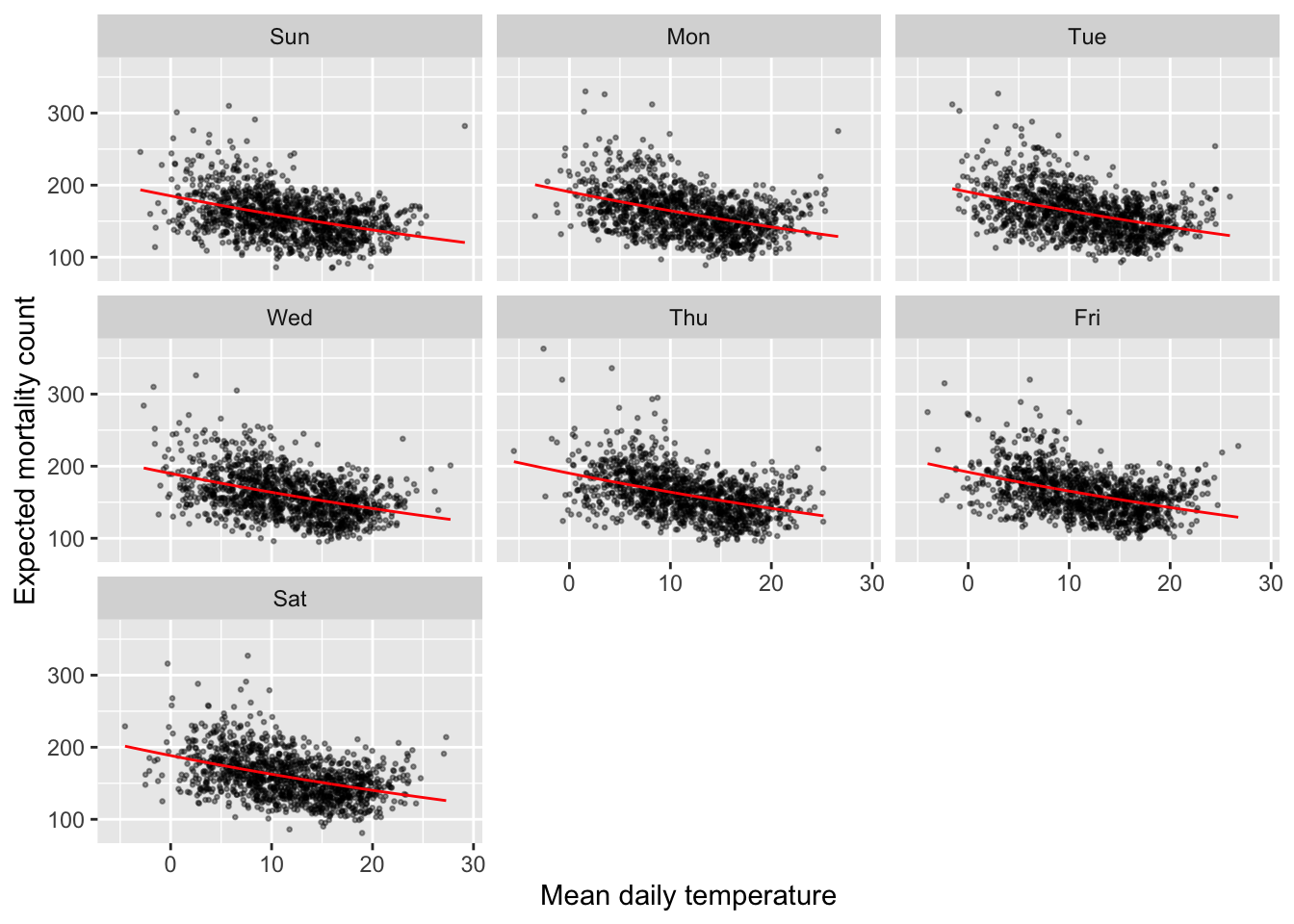
Wrapping up
At this point, the coefficient estimates suggests that risk of mortality tends to decrease as temperature increases. Do you think this is reasonable? What else might be important to build into the model based on your analysis up to this point?